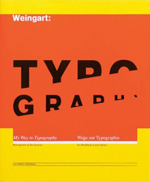
Wolfgang Weingart

In his work, Weingart demonstrates his mastery of typographic rules and the meaning achieved in breaking them. His career is one of curiosity and experience, aptitude rather than learning, and of ordered experiment and visual enjoyment.
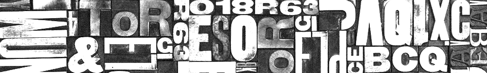
Looking at the complete output of Weingart’s work suggests neither pessimism nor traditionalism. In his earliest experiments, Weingart created abstract patterns with type, and went beyond the unconventional almost to the absurd. But these explorations produced an evolution, a tangible esthetic, and a deep appreciation of typography, all of which are evident throughout Weingart’s work. Weingart’s manifesto, entitled Is This Typography Worth Supporting Or Do We Live On The Moon? shows his mastery of layered type on tinted panels. The technique reappears in color in the early 1980s posters for Kunstkredit, a cultural organization based in Basel, where he uses a film montage technique combined with multilayered dot screens. Such designs would have been almost impossible to create in letterpress, and their use of sizes, spacing, and color defy the ideas of the Swiss typographic tradition enshrined at the Basel school.
But in the turbulent years of the late 1960s, even an institution like Basel could not remain unchanged. When Weingart became a teacher at Basel in 1968, the postgraduate course he proposed and taught was a radical departure from the principles of order, clarity, pattern and rhythm taught by Emil Ruder. Weingart’s class became an international success. Weingart believed that the tradition of Swiss typography played an important international role from the fifties until the end of the sixties, but had become sterile and anonymous. His vision was to breathe new life into the teaching of typography by re-examining the assumed principles of its practice. The only way Weingart was able to break the rules of typography was to know them. He had his students experiment with the limits of legibility and repetition, based on his own experiments. He also learned the skills of photolithography, developing new concepts, masking and overlaying films, and using the camera to distort, enlarge, or blur type.
Weingart’s success as a teacher and as a designer stems from both joy and judgment. His evident pleasure at discovering new possibilities, and in helping students to discover their own potential, is matched only by his knowledge of the technical aspects of his craft. Weingart is an example of how knowledge and imagination can work together creatively. By breaking the traditional rules of typography, Weingart shows his wit, wisdom, and understanding, which has lead to discovery and revelation.