|
Palomar College |
Statistics for the Behavioral
Sciences |
ONLINE |
|
Roger N. Morrissette, PhD
|
|
PSYC 205 and SOC 205
|
COMPUTER ASSIGNMENTS
Exercise 1: Descriptive
Statistics
Objectives:
By the end of this laboratory you should be able to perform the
following activities using Microsoft Excel:
-
Enter Data into an Excel Spreasheet
-
Use Excel Formulas to Calculate Descriptive
Statistics
-
Make a Graph from Continuous Data
-
Make a Graph from Categorical Data
-
Enter Data into SPSS
-
Use SPSS to Calculate Descriptive Statistics
Microsoft Excel
is an easy software to learn and is ideal for doing simple descriptive
statistics (e.g., means and standard deviations) and for making graphs of your
data. I should say to start that there are many ways to use Excel. I will
be showing you one of the simplest ways to enter data, do calculations, and make
graphs. If you are already well versed in using Excel or know of
alternative ways of attaining your end goal, you are certainly free to use them.
I will first go over three basic procedures to using Excel for data analysis.
After all questions have been answered I will give you an exercise that
you will need to complete during class and submit by the next laboratory
meeting. You may work in groups of two on this exercise.
Exercise 1A: Making
a Table and Calculating Descriptive Statistics using Excel
Entering Data into an Excel Spreadsheet
(Video
Lesson CA1a) (YouTube version)
To start
click on the little green X icon for the Microsoft Excel software.
The page
should open up to a grid. Assume the tables below represent that grid.
You are now
ready to go.
Below is the
experimental sample we will be using for this exercise.
Let's say you
are conducting a survey on Binge Drinking. You are particularly
interested in the different perceptions of binge drinking across campus. Your
hypothesis states that members of fraternities will assume that Binge Drinking
involves consuming more drinks in a single sitting than non-members of a
fraternity. You survey 20 male students on campus. Ten of them are
fraternity members and the other 10 are not. Your survey asks only two
questions:
1. For a Male
about 180lbs, how many drinks is considered to be "Binge Drinking"? _________
2. Is Binge
Drinking a problem on this campus? Yes ______ or No _________
When you are
done collecting your data, it is time to enter it into an Excel spreadsheet.
First, each
survey should be numbered at the top. This is your participant number. You
need this to keep track of your participants in case there is an error in data
entry somewhere along the line.
NOTE: you
will not actually be collecting any data. This is an example of something
you might do. Please use the data given, as if it is the data you collected
for this experiment.
Now let's
start entering this data:
In one of the
cells in the Excel spreadsheet, type in the word "Participant" and number the
20 cells below that cell 1 through 20 respectively. You can change the
characteristics of any cell by highlighting it and then clicking on something
on the edit bar. I personally like to have all of my data and labels in 8
point font and to be centered. I also like my data labels to be in bold
so they stand out. You can do whatever you wish. The table below shows
the start of the spreadsheet:
|
|
|
|
|
|
|
|
|
|
Participant |
|
|
|
|
|
|
|
1 |
|
|
|
|
|
|
|
2 |
|
|
|
|
|
|
|
3 |
|
|
|
|
|
|
|
4 |
|
|
|
|
|
|
|
5 |
|
|
|
|
|
|
|
6 |
|
|
|
|
|
|
|
7 |
|
|
|
|
|
|
|
8 |
|
|
|
|
|
|
|
9 |
|
|
|
|
|
|
|
10 |
|
|
|
|
|
|
|
11 |
|
|
|
|
|
|
|
12 |
|
|
|
|
|
|
|
13 |
|
|
|
|
|
|
|
14 |
|
|
|
|
|
|
|
15 |
|
|
|
|
|
|
|
16 |
|
|
|
|
|
|
|
17 |
|
|
|
|
|
|
|
18 |
|
|
|
|
|
|
|
19 |
|
|
|
|
|
|
|
20 |
|
|
|
|
|
|
|
|
|
|
|
|
|
|
|
|
|
|
|
|
|
|
|
|
|
|
|
|
|
|
|
|
|
|
|
|
|
So your first
"column" heading was Participants, your next two columns should be for the
designation of whether the participant was a fraternity member or not. The
fourth column could be for their answer for the number of drinks question, and
the fifth and sixth column can be for whether they answered "yes" or "no" to
the second question. This is shown in the table below:
|
|
|
|
|
|
|
|
|
|
|
Participant |
Frat |
No-Frat |
# Drinks |
Yes |
No |
|
|
|
1 |
|
|
|
|
|
|
|
|
2 |
|
|
|
|
|
|
|
|
3 |
|
|
|
|
|
|
|
|
4 |
|
|
|
|
|
|
|
|
5 |
|
|
|
|
|
|
|
|
6 |
|
|
|
|
|
|
|
|
7 |
|
|
|
|
|
|
|
|
8 |
|
|
|
|
|
|
|
|
9 |
|
|
|
|
|
|
|
|
10 |
|
|
|
|
|
|
|
|
11 |
|
|
|
|
|
|
|
|
12 |
|
|
|
|
|
|
|
|
13 |
|
|
|
|
|
|
|
|
14 |
|
|
|
|
|
|
|
|
15 |
|
|
|
|
|
|
|
|
16 |
|
|
|
|
|
|
|
|
17 |
|
|
|
|
|
|
|
|
18 |
|
|
|
|
|
|
|
|
19 |
|
|
|
|
|
|
|
|
20 |
|
|
|
|
|
|
|
|
|
|
|
|
|
|
|
|
|
|
|
|
|
|
|
|
|
|
|
|
|
|
|
|
|
Now it is
time to enter our data into the spreadsheet. This is best done with two
people. One reading the results of the survey and one entering the data into
the spreadsheet. It will make if very easy to calculate your data if you
use "1" for an appropriate column response. This is called
"coding" the
data. This should make more sense when you look at the "coded" data below.
For our 20 surveys the data looks like this:
|
|
|
|
|
|
|
|
|
|
|
Participant |
Frat |
No-Frat |
# Drinks |
Yes |
No |
|
|
|
1 |
1 |
0 |
8 |
0 |
1 |
|
|
|
2 |
0 |
1 |
3 |
1 |
0 |
|
|
|
3 |
1 |
0 |
10 |
0 |
1 |
|
|
|
4 |
0 |
1 |
7 |
1 |
0 |
|
|
|
5 |
1 |
0 |
6 |
0 |
1 |
|
|
|
6 |
0 |
1 |
5 |
1 |
0 |
|
|
|
7 |
1 |
0 |
6 |
1 |
0 |
|
|
|
8 |
1 |
0 |
8 |
1 |
0 |
|
|
|
9 |
0 |
1 |
6 |
1 |
0 |
|
|
|
10 |
0 |
1 |
4 |
0 |
1 |
|
|
|
11 |
0 |
1 |
4 |
1 |
0 |
|
|
|
12 |
0 |
1 |
6 |
0 |
1 |
|
|
|
13 |
0 |
1 |
5 |
1 |
0 |
|
|
|
14 |
1 |
0 |
5 |
1 |
0 |
|
|
|
15 |
1 |
0 |
12 |
0 |
1 |
|
|
|
16 |
0 |
1 |
3 |
1 |
0 |
|
|
|
17 |
0 |
1 |
4 |
1 |
0 |
|
|
|
18 |
1 |
0 |
9 |
0 |
1 |
|
|
|
19 |
1 |
0 |
8 |
0 |
1 |
|
|
|
20 |
1 |
0 |
6 |
1 |
0 |
|
|
|
|
|
|
|
|
|
|
|
|
|
|
|
|
|
|
|
|
|
|
|
|
|
|
|
|
Notice that
for participant #1, they were a fraternity member, thought that 8 drinks is
considered binge drinking and chose "No" for question two. Now that your
data is all entered, the next section will show you how to use Excel formulas
to do some simple calculations and descriptive statistics.
Using Excel Formulas to Calculate Descriptive Statisitics
(Video
Lesson CA1b) (YouTube version)
Since our data
is part of an experiment that is comparing the responses of fraternity members
and non-members, the first thing we should do is separate our two categories.
You can do this with the "Data Sort" feature of Excel. The first thing you need
to do is to highlight ALL of the data as is shown below:
|
|
|
|
|
|
|
|
|
|
|
Participant |
Frat |
No-Frat |
# Drinks |
Yes |
No |
|
|
|
1 |
1 |
0 |
8 |
0 |
1 |
|
|
|
2 |
0 |
1 |
3 |
1 |
0 |
|
|
|
3 |
1 |
0 |
10 |
0 |
1 |
|
|
|
4 |
0 |
1 |
7 |
1 |
0 |
|
|
|
5 |
1 |
0 |
6 |
0 |
1 |
|
|
|
6 |
0 |
1 |
5 |
1 |
0 |
|
|
|
7 |
1 |
0 |
6 |
1 |
0 |
|
|
|
8 |
1 |
0 |
8 |
1 |
0 |
|
|
|
9 |
0 |
1 |
6 |
1 |
0 |
|
|
|
10 |
0 |
1 |
4 |
0 |
1 |
|
|
|
11 |
0 |
1 |
4 |
1 |
0 |
|
|
|
12 |
0 |
1 |
6 |
0 |
1 |
|
|
|
13 |
0 |
1 |
5 |
1 |
0 |
|
|
|
14 |
1 |
0 |
5 |
1 |
0 |
|
|
|
15 |
1 |
0 |
12 |
0 |
1 |
|
|
|
16 |
0 |
1 |
3 |
1 |
0 |
|
|
|
17 |
0 |
1 |
4 |
1 |
0 |
|
|
|
18 |
1 |
0 |
9 |
0 |
1 |
|
|
|
19 |
1 |
0 |
8 |
0 |
1 |
|
|
|
20 |
1 |
0 |
6 |
1 |
0 |
|
|
|
|
|
|
|
|
|
|
|
|
|
|
|
|
|
|
|
|
|
|
|
|
|
|
|
|
Then at the top
of the excel document, find and select "Data", then
select "Sort". On the left side you should see
"Sort by" with a down arrow next to it. Click on the down arrow and select
"Frat"
(the title of the second column) and then "OK". Your spreadsheet should
look like this:
|
|
|
|
|
|
|
|
|
|
|
Participant |
Frat |
No-Frat |
# Drinks |
Yes |
No |
|
|
|
2 |
0 |
1 |
3 |
1 |
0 |
|
|
|
4 |
0 |
1 |
7 |
1 |
0 |
|
|
|
6 |
0 |
1 |
5 |
1 |
0 |
|
|
|
9 |
0 |
1 |
6 |
1 |
0 |
|
|
|
10 |
0 |
1 |
4 |
0 |
1 |
|
|
|
11 |
0 |
1 |
4 |
1 |
0 |
|
|
|
12 |
0 |
1 |
6 |
0 |
1 |
|
|
|
13 |
0 |
1 |
5 |
1 |
0 |
|
|
|
16 |
0 |
1 |
3 |
1 |
0 |
|
|
|
17 |
0 |
1 |
4 |
1 |
0 |
|
|
|
1 |
1 |
0 |
8 |
0 |
1 |
|
|
|
3 |
1 |
0 |
10 |
0 |
1 |
|
|
|
5 |
1 |
0 |
6 |
0 |
1 |
|
|
|
7 |
1 |
0 |
6 |
1 |
0 |
|
|
|
8 |
1 |
0 |
8 |
1 |
0 |
|
|
|
14 |
1 |
0 |
5 |
1 |
0 |
|
|
|
15 |
1 |
0 |
12 |
0 |
1 |
|
|
|
18 |
1 |
0 |
9 |
0 |
1 |
|
|
|
19 |
1 |
0 |
8 |
0 |
1 |
|
|
|
20 |
1 |
0 |
6 |
1 |
0 |
|
|
|
|
|
|
|
|
|
|
|
|
|
|
|
|
|
|
|
Notice how the
frat members are now separate from the non-frat members. Now we can simply
insert a few rows between our two groups. The easiest way to do this is to
go to the row number cell that has participant #1 in it (the dividing line
between our two groups) and click on it. This will highlight the entire row all
across the spreadsheet. Then at the top of the excel document find and select
"Home" and then select
"Insert". You will see that it
inserts a blank row between your two groups of data. Repeat this 3 more times to
give yourself a total of 4 rows separation between the two groups of data. The
new spreadsheet should look like the one below:
|
|
|
|
|
|
|
|
|
|
|
Participant |
Frat |
No-Frat |
# Drinks |
Yes |
No |
|
|
|
2 |
0 |
1 |
3 |
1 |
0 |
|
|
|
4 |
0 |
1 |
7 |
1 |
0 |
|
|
|
6 |
0 |
1 |
5 |
1 |
0 |
|
|
|
9 |
0 |
1 |
6 |
1 |
0 |
|
|
|
10 |
0 |
1 |
4 |
0 |
1 |
|
|
|
11 |
0 |
1 |
4 |
1 |
0 |
|
|
|
12 |
0 |
1 |
6 |
0 |
1 |
|
|
|
13 |
0 |
1 |
5 |
1 |
0 |
|
|
|
16 |
0 |
1 |
3 |
1 |
0 |
|
|
|
17 |
0 |
1 |
4 |
1 |
0 |
|
|
|
|
|
|
|
|
|
|
|
|
|
|
|
|
|
|
|
|
|
|
|
|
|
|
|
|
|
|
|
|
|
|
|
|
|
|
|
1 |
1 |
0 |
8 |
0 |
1 |
|
|
|
3 |
1 |
0 |
10 |
0 |
1 |
|
|
|
5 |
1 |
0 |
6 |
0 |
1 |
|
|
|
7 |
1 |
0 |
6 |
1 |
0 |
|
|
|
8 |
1 |
0 |
8 |
1 |
0 |
|
|
|
14 |
1 |
0 |
5 |
1 |
0 |
|
|
|
15 |
1 |
0 |
12 |
0 |
1 |
|
|
|
18 |
1 |
0 |
9 |
0 |
1 |
|
|
|
19 |
1 |
0 |
8 |
0 |
1 |
|
|
|
20 |
1 |
0 |
6 |
1 |
0 |
|
|
|
|
|
|
|
|
|
|
|
|
|
|
|
|
|
|
|
|
|
|
|
|
|
|
|
|
Now we can do
our calculations. First let's calculate the means of column four for each group.
Go to the cell below the last number in column four for the "No-Frat" group and
highlight it by clicking on it. Then type the following: =average(
then drag and highlight all the cells you want to include in your average (they
will appear after the open parentheses mark), and then add the closed
parentheses mark and hit "Enter".
My formula was "=average(F5-F14)"
for the top group and "=average(F19-F28)" for the
bottom. Your formula may differ based on where you placed your data on the grid.
The mean of the
column appears in the originally highlighted cell. The table below shows
the means for both groups:
|
|
|
|
|
|
|
|
|
|
|
Participant |
Frat |
No-Frat |
# Drinks |
Yes |
No |
|
|
|
2 |
0 |
1 |
3 |
1 |
0 |
|
|
|
4 |
0 |
1 |
7 |
1 |
0 |
|
|
|
6 |
0 |
1 |
5 |
1 |
0 |
|
|
|
9 |
0 |
1 |
6 |
1 |
0 |
|
|
|
10 |
0 |
1 |
4 |
0 |
1 |
|
|
|
11 |
0 |
1 |
4 |
1 |
0 |
|
|
|
12 |
0 |
1 |
6 |
0 |
1 |
|
|
|
13 |
0 |
1 |
5 |
1 |
0 |
|
|
|
16 |
0 |
1 |
3 |
1 |
0 |
|
|
|
17 |
0 |
1 |
4 |
1 |
0 |
|
|
|
|
|
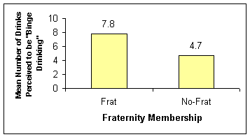
Mean |
4.7 |
|
|
|
|
|
|
|
|
|
|
|
|
|
|
|
|
|
|
|
|
|
|
|
|
|
|
|
|
|
|
|
|
1 |
1 |
0 |
8 |
0 |
1 |
|
|
|
3 |
1 |
0 |
10 |
0 |
1 |
|
|
|
5 |
1 |
0 |
6 |
0 |
1 |
|
|
|
7 |
1 |
0 |
6 |
1 |
0 |
|
|
|
8 |
1 |
0 |
8 |
1 |
0 |
|
|
|
14 |
1 |
0 |
5 |
1 |
0 |
|
|
|
15 |
1 |
0 |
12 |
0 |
1 |
|
|
|
18 |
1 |
0 |
9 |
0 |
1 |
|
|
|
19 |
1 |
0 |
8 |
0 |
1 |
|
|
|
20 |
1 |
0 |
6 |
1 |
0 |
|
|
|
|
|
Mean |
7.8 |
|
|
|
|
|
|
|
|
|
|
|
|
|
|
|
|
|
|
|
|
|
Notice that I
have added the word "Mean" to both groups of data and made my means bold and
red. Now let's calculate the percentage of people who answered "yes" or "no" for
both data sets. We will need to know the sum of the "yes" and "no" columns
and the total count of all the participants in each group. We use the same type
of formula as in calculating the mean but instead of using the word "average" we
use the words "sum" and "count" in its place. So we want the sums of
columns 5 and 6 and the count of column 1 for both groups. Do it the same way as
above but just change the formula words and highlighted cells. The table
below shows my sum and count values:
|
|
|
|
|
|
|
|
|
|
|
Participant |
Frat |
No-Frat |
# Drinks |
Yes |
No |
|
|
|
2 |
0 |
1 |
3 |
1 |
0 |
|
|
|
4 |
0 |
1 |
7 |
1 |
0 |
|
|
|
6 |
0 |
1 |
5 |
1 |
0 |
|
|
|
9 |
0 |
1 |
6 |
1 |
0 |
|
|
|
10 |
0 |
1 |
4 |
0 |
1 |
|
|
|
11 |
0 |
1 |
4 |
1 |
0 |
|
|
|
12 |
0 |
1 |
6 |
0 |
1 |
|
|
|
13 |
0 |
1 |
5 |
1 |
0 |
|
|
|
16 |
0 |
1 |
3 |
1 |
0 |
|
|
|
17 |
0 |
1 |
4 |
1 |
0 |
|
|
Count |
10 |
|
Mean |
4.7 |
|
|
|
|
|
|
|
|
Sum |
8 |
2 |
|
|
|
|
|
|
|
|
|
|
|
|
|
|
|
|
|
|
|
|
|
1 |
1 |
0 |
8 |
0 |
1 |
|
|
|
3 |
1 |
0 |
10 |
0 |
1 |
|
|
|
5 |
1 |
0 |
6 |
0 |
1 |
|
|
|
7 |
1 |
0 |
6 |
1 |
0 |
|
|
|
8 |
1 |
0 |
8 |
1 |
0 |
|
|
|
14 |
1 |
0 |
5 |
1 |
0 |
|
|
|
15 |
1 |
0 |
12 |
0 |
1 |
|
|
|
18 |
1 |
0 |
9 |
0 |
1 |
|
|
|
19 |
1 |
0 |
8 |
0 |
1 |
|
|
|
20 |
1 |
0 |
6 |
1 |
0 |
|
|
Count |
10 |
|
Mean |
7.8 |
|
|
|
|
|
|
|
|
Sum |
4 |
6 |
|
|
|
|
|
|
|
|
|
|
Some of you may
be saying "why don't we just count them by hand". That could be done for this
small group of data, but remember you will have around 200 participants. It is
best to learn the formulas now on this small group of data. Now that we have
the count totals and the sums, we can calculate the percentages of "yes" and "no"
responses for each group. To calculate the percentage we simply take the
sum of the column and divide by that by the count of the column and then multiply that product by 100. I
usually make a percentage calculation cell using the Excel formula. The
table with the percentages is shown below:
|
|
|
|
|
|
|
|
|
|
|
Participant |
Frat |
No-Frat |
# Drinks |
Yes |
No |
|
|
|
2 |
0 |
1 |
3 |
1 |
0 |
|
|
|
4 |
0 |
1 |
7 |
1 |
0 |
|
|
|
6 |
0 |
1 |
5 |
1 |
0 |
|
|
|
9 |
0 |
1 |
6 |
1 |
0 |
|
|
|
10 |
0 |
1 |
4 |
0 |
1 |
|
|
|
11 |
0 |
1 |
4 |
1 |
0 |
|
|
|
12 |
0 |
1 |
6 |
0 |
1 |
|
|
|
13 |
0 |
1 |
5 |
1 |
0 |
|
|
|
16 |
0 |
1 |
3 |
1 |
0 |
|
|
|
17 |
0 |
1 |
4 |
1 |
0 |
|
|
Count |
10 |
|
Mean |
4.7 |
|
|
|
|
|
|
|
|
Sum |
8 |
2 |
|
|
|
|
|
|
% |
80 |
20 |
|
|
|
|
|
|
|
|
|
|
|
|
1 |
1 |
0 |
8 |
0 |
1 |
|
|
|
3 |
1 |
0 |
10 |
0 |
1 |
|
|
|
5 |
1 |
0 |
6 |
0 |
1 |
|
|
|
7 |
1 |
0 |
6 |
1 |
0 |
|
|
|
8 |
1 |
0 |
8 |
1 |
0 |
|
|
|
14 |
1 |
0 |
5 |
1 |
0 |
|
|
|
15 |
1 |
0 |
12 |
0 |
1 |
|
|
|
18 |
1 |
0 |
9 |
0 |
1 |
|
|
|
19 |
1 |
0 |
8 |
0 |
1 |
|
|
|
20 |
1 |
0 |
6 |
1 |
0 |
|
|
Count |
10 |
|
Mean |
7.8 |
|
|
|
|
|
|
|
|
Sum |
4 |
6 |
|
|
|
|
|
|
% |
40 |
60 |
|
|
|
|
|
|
|
|
|
|
My formula for
the percentage of "yes" answers by the "Frat" group is:
=(G16/C15)*100
The Percentage
"No" formula is: =(H16/C15)*100 Once you have
the formulas for the top group, you can just copy and past the formulas for the
bottom group. Always check your answers the first few times that you make
formulas. Now that we have all of our data calculated we are ready to make a
graph of our data.
****Cut and
Paste
this final spreadsheet into an MSWord or pdf document as part of Computer
Exercise #1 to be submitted*****
Exercise 1B: Making
a Graph of your Continuous Data
Make a Graph of Continuous Data
(Video
Lesson CA1c) (YouTube version)
I have found
that the easiest way to make a graph in excel is to NOT try to do it from the
data table that you used to calculate your sums, means, and percentages. The
best way to start a graph is to make a summary data table. For the first
graph we will use our continuous data. This graph should show the difference in
means for "# of drinks" assumed to be binge drinking for the "Frat" group and
the "No-Frat" group. Let's start by making a summary table for the
"# of drinks" data. First, enter the levels of your
independent variable in one column (e. g., "Frat" and "No-Frat"), then enter the
data values of your dependent variable in the bordering column (our calculated
values). Good luck.
Next, highlight
all the cells that contain any information for the graph.
Then at the
top of the Excel document, find and select "Insert". Click on the
"Column" icon on the top tool bar (it looks like a
little bar graph). Select your chart type. A basic chart should appear
on your document. Now, if you look at the top of the Excel document again,
find and select "Layout". Click on
"Axis Titles". To
label your horizontal axis, select "Primary Horizontal
Axis Title" and click on "Title Below Axis".
To label your vertical axis, select "Primary Vertical
Axis Title" and click on "Rotated Title".
After labeling your horizontal and vertical axis, click on
"Axes", select "Primary
Vertical Axis" and pick "More Primary Vertical
Axis Options...". In the "Axis Options"
you will select "Fixed" for the
"Major Unit". Type a 2 in the blank next to Major Unit and hit Close. APA
format does not use graph titles. It should look
something like this:
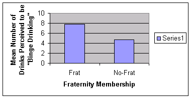
If you highlight the graph you can enlarge it or shrink it
or move it where ever you like on the spreadsheet.
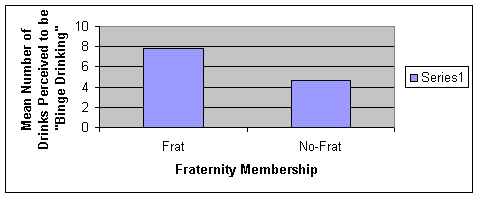
You can remove the "Series 1" box by clicking on it and
hitting the delete key.
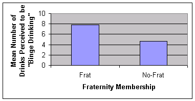
You can modify all aspects of the graph by double clicking
on the specify region. The only way to get good at this is to play
around with editing. Good luck making your graphs!
****Cut and Paste this final graph into an MSWord or
pdf document as part of Computer Exercise #1 to be submitted*****
Exercise 1C: Making
a Graph of Categorical Data
Make a Graph
of Categorical Data
(Video
Lesson CA1d) (YouTube version)
This second graph should show the percentages of those who
answered "yes" to the question as to whether binge drinking is a problem on
this campus for each of the groups. There is no need to graph the "no"
response because it will just be the inverse of the "yes" and not give us
any new information. Although you could plot frequency on your y axis, it is
most always best to plot percentages - please do this. Also, whenever you
plot percentages, make sure that the y axis goes from "0" to "100". Use
the same methods used to graph your continuous data (Exercise 1B) for
your categorical data.
****Cut and Paste this final graph into an MSWord or
pdf document as part of Computer Exercise #1 to be submitted*****
Exercise 1D: Making a Table and
Calculating Descriptive Statistics using
SPSS
Enter
Data Using SPSS
(Video
Lesson CA1e) (YouTube version)
This exercise will teach you how to begin to use the very
powerful statistical software, SPSS. You will be
using this software to analyze the data that you collect this semester. One of
the trickiest parts of using SPSS is the very first step:
Entering Data. Data entry in SPSS is considerably
different than data entry in Excel so please pay very close attention to the
steps below. To show you the difference between these two pieces of software
we will be using the same data for this exercise as we used in
Exercise 01: Using Excel. The data below is
the same that we collected for the "Fraternity/Binge Drinking" study:
| |
|
|
|
|
|
|
|
| |
Participant |
Frat |
No-Frat |
# Drinks |
Yes |
No |
|
| |
1 |
1 |
0 |
8 |
0 |
1 |
|
| |
2 |
0 |
1 |
3 |
1 |
0 |
|
| |
3 |
1 |
0 |
10 |
0 |
1 |
|
| |
4 |
0 |
1 |
7 |
1 |
0 |
|
| |
5 |
1 |
0 |
6 |
0 |
1 |
|
| |
6 |
0 |
1 |
5 |
1 |
0 |
|
| |
7 |
1 |
0 |
6 |
1 |
0 |
|
| |
8 |
1 |
0 |
8 |
1 |
0 |
|
| |
9 |
0 |
1 |
6 |
1 |
0 |
|
| |
10 |
0 |
1 |
4 |
0 |
1 |
|
| |
11 |
0 |
1 |
4 |
1 |
0 |
|
| |
12 |
0 |
1 |
6 |
0 |
1 |
|
| |
13 |
0 |
1 |
5 |
1 |
0 |
|
| |
14 |
1 |
0 |
5 |
1 |
0 |
|
| |
15 |
1 |
0 |
12 |
0 |
1 |
|
| |
16 |
0 |
1 |
3 |
1 |
0 |
|
| |
17 |
0 |
1 |
4 |
1 |
0 |
|
| |
18 |
1 |
0 |
9 |
0 |
1 |
|
| |
19 |
1 |
0 |
8 |
0 |
1 |
|
| |
20 |
1 |
0 |
6 |
1 |
0 |
|
| |
|
|
|
|
|
|
|
| |
|
|
|
|
|
|
|
| |
|
|
|
|
|
|
|
- Now
let's get started using SPSS software.
- If there isn't an SPSS
icon on the desktop, you can start the SPSS
software by going to Start, then
All Programs, and then clicking on the
IBM SPSS Statistics folder and then the
IBM SPSS Statistics 22 file (or whatever version happens to be
loaded on the computer you are working on). This is the latest version of SPSS
so the file you click on may be different if you are using a computer
system that is not totally updated.
- You may then get a
screen that asks if you want to use "Unicode Encoding". If you get this
prompt, choose "Use Unicode encoding".
- You should then get a
prompt to open a new data file. Select the option to
"Open a New Data file" .
- Another version might ask:
"What do you want to do?" You should click the
"type in data" option and it will
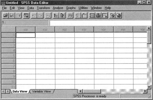
open a data file for you like the one below.
|
-
Notice that you are in "Data View"
(from the tabs at the bottom).
-
To begin entering our data we must first identify our
Variables.
-
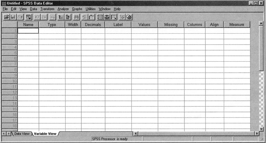
To do this we must use the lower tabs and select
"Variable View".
-
A blank "Variable View"
window is shown below:
-
Now that we are in "Variable View"
we can enter the variables that are important to our study.
-
For our "Fraternity/Binge Drinking" study, our variables
are:
-
1. Participant or "ID" number
-
2. Fraternity member or Non-Fraternity member
(our independent variable)
-
3. The answer to question 1:
For a Male about 180lbs, how
many drinks is considered to be "Binge Drinking"? _________
(our continuous dependent variable)
-
4. The answer to question
2: Is Binge
Drinking a problem on this campus? Yes ______ or No _________
(our categorical dependent variable)
-
Note that we did not measure any other variables like:
"age", "ethnicity", "GPA", if we had we would be adding them to the data
sheet.
-
Now we need to give each variable a name. How about...
-
1. ID
-
2. Frat
-
3. Drinks
-
4. Problem
-
Each variable name must:
-
In "Variable View", each
"row" is a variable and each
"column" is a characteristic of that variable.
-
Now click on the first empty cell under the
"Name" column and enter our first variable name,
"ID". Continue for the next 3 variables. SPSS will assign default
variable characteristics to each variable.
-
The "Type" column describes the
type of data:
-
The "Width" column can be used
to change the 8 character default setting for your variable names.
-
The "Decimal" column assigns
the number of decimals you want for each variable.
-
The "Label" column is the place
to give a more detailed description of the variable or its values.
-
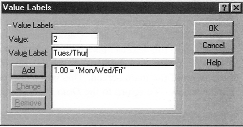
The "Value" column is where you
describe the variable codes and labels.
-
Define all the categorical or
"coded" variables for
our data.
-
Make sure that you routinely save all of your work.
-
Now you are ready to enter the data for each of your
participants.
-
When you are done entering data, double check your entries,
and save your work.
Using
SPSS to Calculate Descriptive Statistics
(Video
Lesson CA1f) (YouTube version)
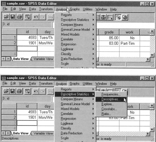
-
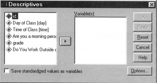
To choose a variable for analysis, simply click on it and
click on the arrow in the middle of the box.
-
This will move it to the "Variables"
box.
-
In this section of SPSS descriptive statistics are means and standard
deviations.
-
These can only be used on continuous data.
-
So, you should only do this
analysis on the continuous DV.
-
Finally click "OK" to compute
the descriptive statistics any and all continuous data.
-
Calculate the descriptive statistics for your data.
-
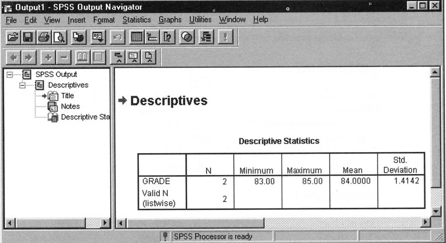
SPSS will generate an "Output Window"
containing the analysis of your data.
-
You should
end up getting an output looking similar to the one above.
-
Read it
carefully and try to figure out what it is saying?
-
Is this the
data we were looking for?
-
If it is,
Open up a Microsoft Word file and cut and paste this table into the document
for safe keeping and for printing out.
****Cut
and Paste
this table into an MSWord or pdf document as part of Computer
Exercise #1 to be submitted*****
-
The
descriptives we calculated above are for all the data combined.
-
We need to
compare the mean values between the two levels of our Independent Variable
(ie., Frat, No-Frat)
-
To find
this descriptive data we must do the descriptive statistic analysis for each of our
Frat Membership groups individually.
-
We can do
this by going to "Analyze", then
"Compare Means", and then
"Means" as is shown below:
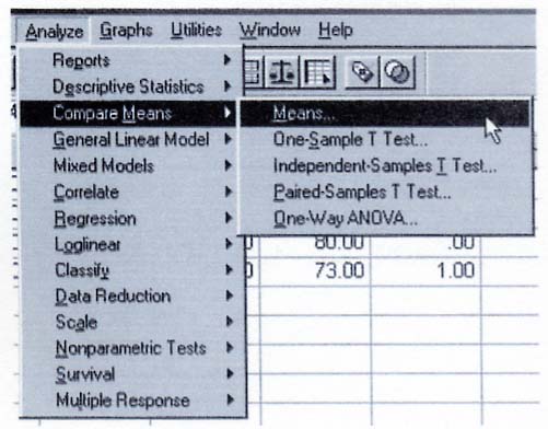
-
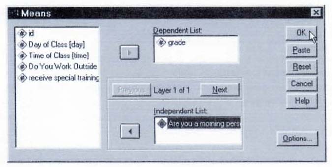
It will ask
you for the "Dependent List" and the
"Independent List".
-
Drag the
dependent variable (continuous only) into the "Dependent List"
and the independent variable into the "Independent
List" list and hit "OK".
-
Compare
your output with the one generated using Excel.
-
Cut and
paste this table into your Word document.
****Cut and Paste this table
into an MSWord or pdf document as part of Computer Exercise #1 to be
submitted*****
-
Now let's
calculate the descriptive statistics for the categorical dependent variable
-
For this
we use the "Analyze", "Descriptive Statistics", and then "Crosstabs"
function to compare the "yes" percentages of the
"Frat" and
"No-Frat"
groups.
-
Place
your IV into the "Rows" space and the Categorical DV into the
"Columns"
space.
-
Then
click the "Cells" option and check off the Percentage
"Rows" option.
-
Click
"OK" and you should get the same percentage figures for the categorical DV
as you got with the Excel exercise.
-
Double
check that they match the values you got using Excel.
-
Add this
final table to your Word document and print this sheet out to hand in with
your Excel exercise.
****Cut and Paste this table
into an MSWord or pdf document as part of Computer Exercise #1 to be
submitted*****
rmorrissette@palomar.edu